Create an email campaign
An email campaign is a single marketing message sent to many customers at once — an invitation to a workshop, say, or news about a new pass.
Start a campaign
Section titled “Start a campaign”- In the office panel open Email campaigns.
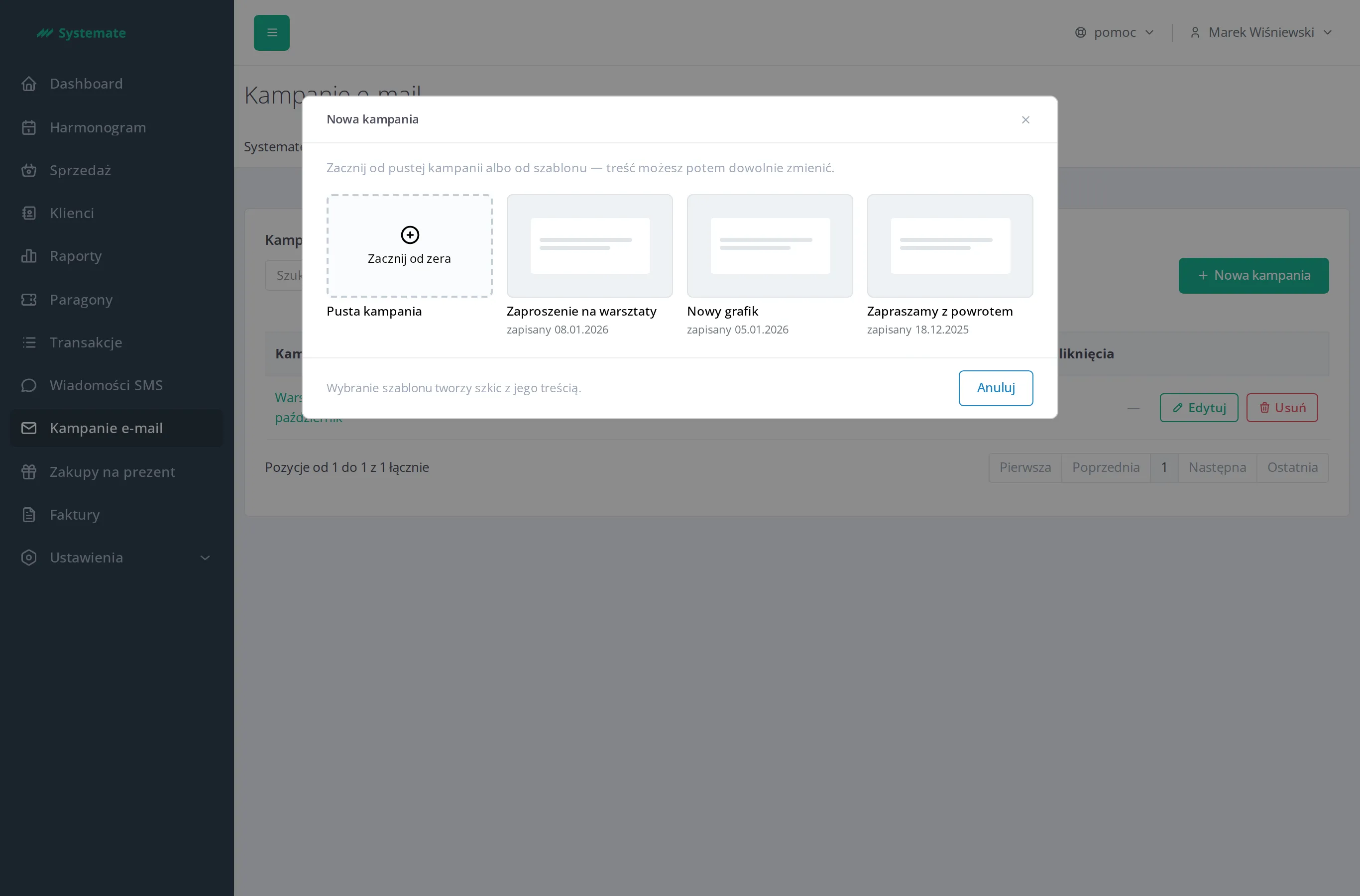
- Click New campaign. If the studio has no templates yet, the creator opens straight away with an empty campaign.
- If the studio has templates, choose a starting point:
- Empty campaign — start from scratch,
- a template tile — the campaign is created with that template’s content, which you can then change freely. See Manage campaign templates.
The Campaign creator opens with three steps: 1. Content, 2. Recipients, 3. Summary and sending. You can move between the steps in any order.
Copy an existing campaign
Section titled “Copy an existing campaign”If you want a new campaign to look similar to a previous one, you don’t have to build it from scratch:
- In the Email campaigns list, click Copy in the campaign row — the button is next to every campaign, including finished and archived ones. You’ll find the same button in the campaign details header.
- A new draft campaign named “
(copy)” is created, and its creator opens straight away at step 1. Content. The original remains unchanged.
The copy takes over the subject, preview text, content blocks, header colours and recipient selection (all customers with consent, or customers with a tag). It does not take over the send date, the approval, the recipient list or the send results — it is a new campaign, and its recipients are counted anew at the time of sending.
If the tag the original was sent to has been deleted in the meantime, step 2. Recipients of the copy marks it as unavailable — choose the recipients again.
Name and title the message
Section titled “Name and title the message”In step 1. Content, while no block of the message is selected, the panel on the right shows the Message settings. Fill in there:
- Campaign working name — visible only to the studio team, customers never see it. It is how you recognise the campaign in the list.
- Message subject — what the customer sees in their inbox. The counter below the field enforces the 150-character limit.
- Preview text (preheader) — the snippet the mailbox shows next to the subject.
Build the content from blocks
Section titled “Build the content from blocks”Step 1. Content shows the message as the customer will see it, and you work directly on it. Above the message sits a switch with two modes:
- Edit — blocks carry an outline, an action bar, and a button to add a new block,
- Preview — the message with nothing added, exactly as it lands in the inbox.
In Edit mode you add a new block in one of two ways:
- in an empty message, click the Add a block field above the footer,
- once the message has blocks, point at a block (or select it) and click the plus Add a block below on its bottom edge.
Then pick one of the kinds:
| Block | What it is for |
|---|---|
| Heading | A large section title |
| Paragraph | Text with personalisation |
| Image | A photo or graphic from the studio library |
| Link button | A call to action — the label plus the address it leads to |
| Divider | A horizontal separating line |
| Two columns | A container for two columns of blocks side by side |
A new block goes directly below the block whose plus you clicked, and it is selected right away. When you delete every block, the Add a block field comes back. Click a block in the message to select it — its fields open in the panel on the right (we call it the drawer). That is where you change the selected block’s content and colours. When you add or click a Paragraph or a Link button, the cursor is already in its Paragraph content or Button text field — you can start typing right away. The Message settings link next to the block’s name deselects it and brings the message settings back. The block’s action bar — shown when you point at a block and on the selected block — carries the icons Move up, Move down, Duplicate, and Delete; the separate Location card of the drawer shows which block it is out of how many, and whether it sits at full width or in a column.
The Image block does not take a file directly — when you add it or click a block with no image yet, the studio library opens right away and you pick an image there. You change an image already chosen with Change image in the drawer. See Manage the image library.
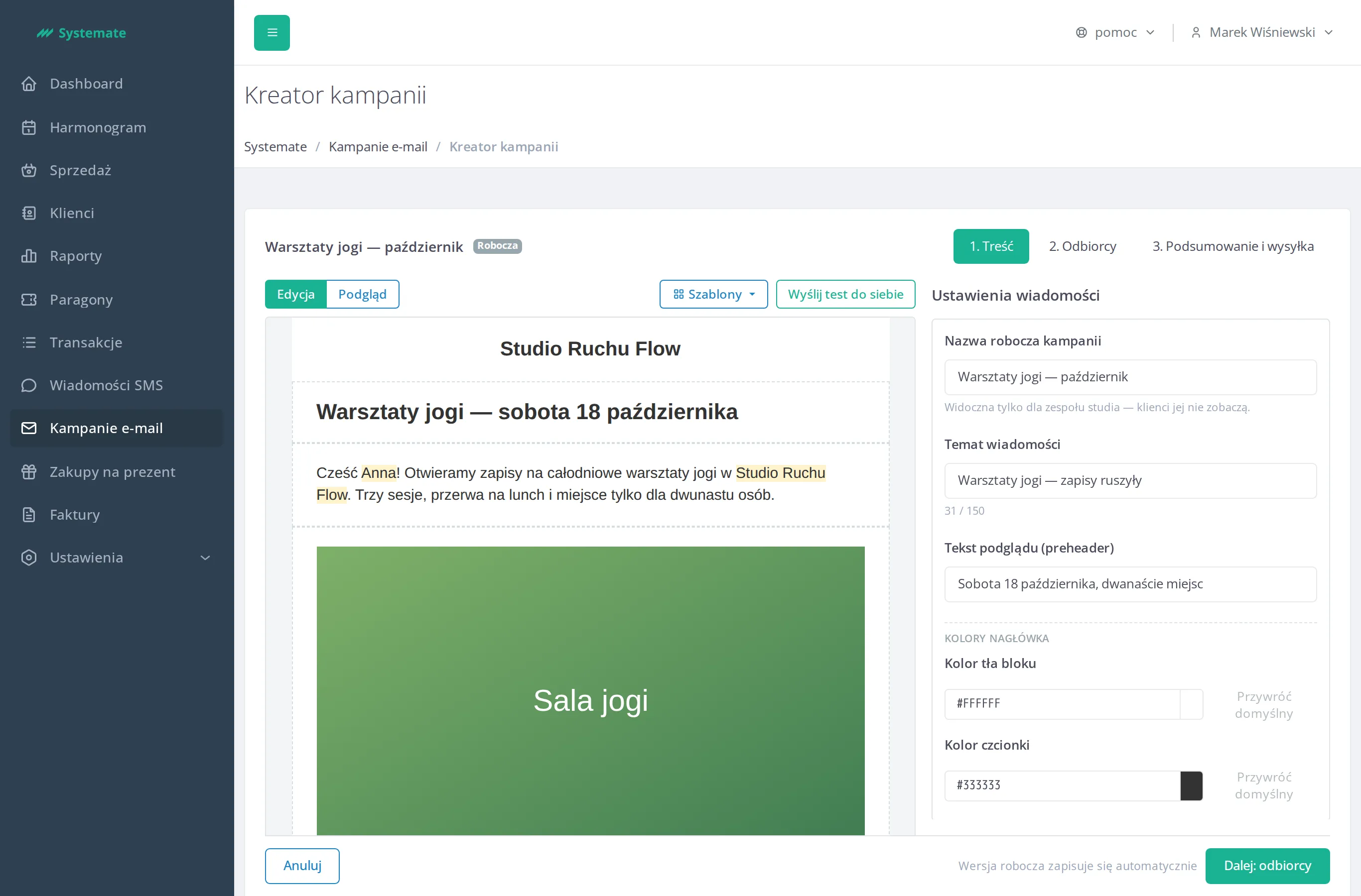
The message opens with Studio logo and name — the bar at the top, carrying the logo and name from your studio’s settings. You recolour it in the Message settings, in the Header colors section. The header is optional: hover over it and click Remove header if the message should go without it. To bring it back, open any Add a block menu and choose Studio logo and name at its top — the header always returns to the very top of the message, in the colours it had before. You cannot move the header: it always stands first. At the end sits the Footer — added automatically to every message, it cannot be removed or edited. It carries the link customers use to unsubscribe from marketing messages and is the only part labelled as fixed.
Put two columns side by side
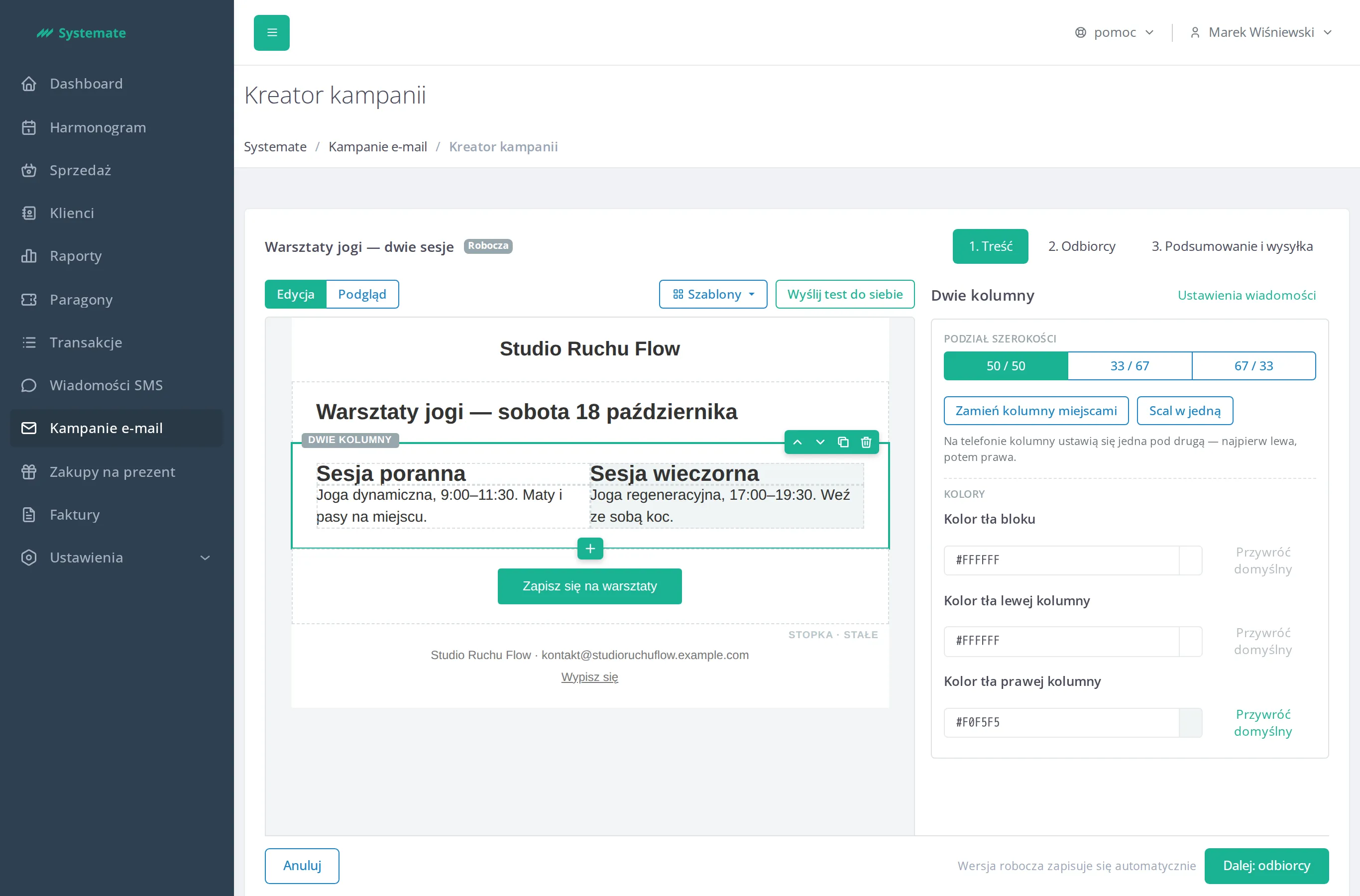
Section titled “Put two columns side by side”The Two columns block holds two columns of blocks next to each other — a description on the left and an image on the right, say. There are two ways in:
- add a Two columns block with empty columns and fill each one separately,
- or select an existing block and, in the drawer’s Location section, click Divide into two columns — the block moves into the left column and the right one stays empty.
You fill an empty column from its own Add a block field. Further blocks come from the Add a block below plus under a block in the column — the new block stays in that same column. Blocks nest no deeper than that: you cannot put another two-columns block inside a column.
Click the TWO COLUMNS label above the block to select the container itself. The drawer then lets you set:
- Width distribution — 50 / 50, 33 / 67, or 67 / 33,
- Swap the columns — the left and right contents change places,
- Merge into one — the container disappears and the blocks of both columns line up one under another, the left column’s first, then the right one’s,
- Block background colour, plus Background colour of the left column and Background colour of the right column separately.
Side by side, both columns are the same height: the shorter one reaches as low as the longer one, so its background colour ends at the same height. Once they are stacked one below the other, each column is as tall as what stands in it.
In narrow mailboxes — so, on a phone — the columns do not fit side by side: the left one shows above the right one. The drawer says so in a note under the ratio.
Pick the colours
Section titled “Pick the colours”A selected block has a Colours section in the drawer whose fields depend on the block type:
- Block background colour — in every block,
- Font colour — in the heading, the paragraph, and the logo bar,
- Button background colour and Button font colour — in the button block,
- Line colour — in the divider.
Enter a colour as a hex value (#1AB394, say) or pick it from the palette that opens
when you click the swatch. The Restore default button next to the field returns to
the standard Systemate colour.
Insert the customer’s name and the studio name
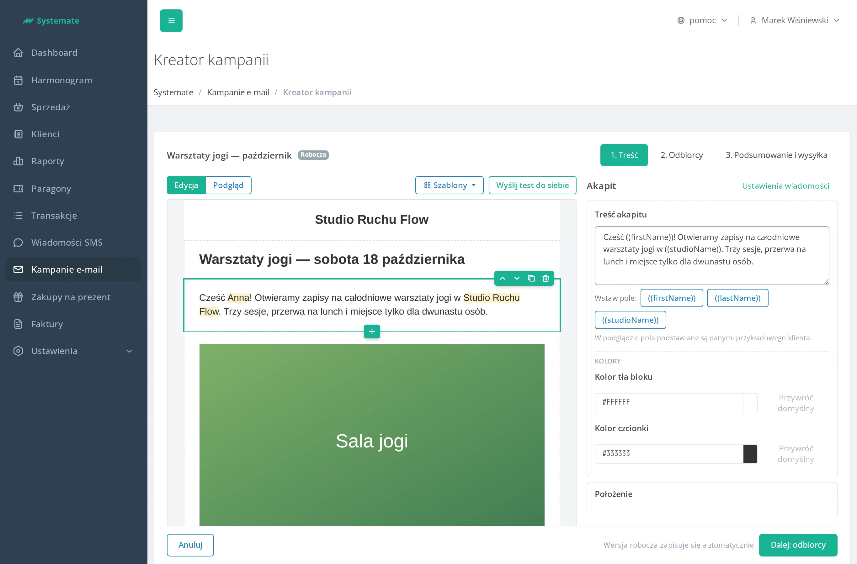
Section titled “Insert the customer’s name and the studio name”In the drawer of the Heading, Paragraph, and Link button blocks, below the text field, you will find Insert field: buttons. Place the cursor where the customer’s data should go and click one of them:
((firstName))— the customer’s first name,((lastName))— the customer’s last name,((studioName))— your studio’s name.
When the campaign is sent, every recipient gets the message with their own details. In the preview the fields are filled with a sample customer’s data and highlighted in yellow.
Check how it looks
Section titled “Check how it looks”Switch to Preview mode — the message loses its outlines and action bars, so you see exactly what the customer will get. The Computer / Phone switch next to it shows the message at computer or phone width; in the phone view two-column blocks stack one under the other. The preview refreshes with every change.
To see the message in a real inbox click Send a test to yourself — the button sits in the bar above the message, on the right, in both modes. It goes to the email address of your staff account and does not touch the recipient list.
The campaign saves itself — the note next to the buttons shows Saving…, Saved automatically, or Could not save the changes. There is no separate “Save” button.
Once the content is ready, click Next: recipients — see Choose the campaign recipients.